
Before Yellow Became Light
A Study of Earth Colors Across Italy, France and Portugal
Before yellow became light, it was earth. Long before it appeared on palace walls, café façades, painted interiors, and sunlit rooms, yellow lived in mineral form — inside ochre, clay, stone, and dust. Red followed the same ancient path. These were not rare or precious colors at first; they were practical, stable, and close to the ground.
That is why yellow and red appear so often in frescoes, painted interiors, limewashed façades, and historic architecture. Unlike certain blues, which were historically expensive and often imported from far away, yellow and red ochres could be found in the earth, prepared as pigment, and carried into plaster, lime, and architecture. They were beautiful, yes, but they were also useful.
Across Italy, France, and Portugal, these colors tell a story that is less about decoration and more about material, climate, memory, and place.
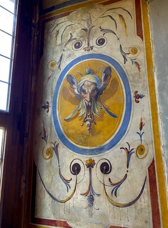
Palazzo Ducale di Mantova, Mantua, Italy — yellow as ornament, red as structure.
In Italy, yellow and red appear first as a language of ornament, but also as a language of practicality. Fresco and wall painting depended on pigments that could survive inside architectural surfaces and remain stable over time. Earth pigments — especially yellow ochre and red ochre — were among the most reliable choices. They came from minerals, not fragile dyes, and they could hold their color within plaster and painted walls.
Yellow could suggest warmth, light, and volume. Red could frame, divide, and give rhythm. Blue, by contrast, often carried another kind of value: rarity, distance, and luxury. So while blue could signal preciousness, yellow and red became the working language of walls.
From painted ornament, yellow begins to move into architecture. What appears in Italy as a controlled interior language — framed, balanced, and contained — becomes in France part of the room itself. The same family of colors — yellow, red, ochre, and stone — now belongs not only to decoration, but to plaster, staircases, shadows, and light. This is the quiet shift from color as detail to color as atmosphere.
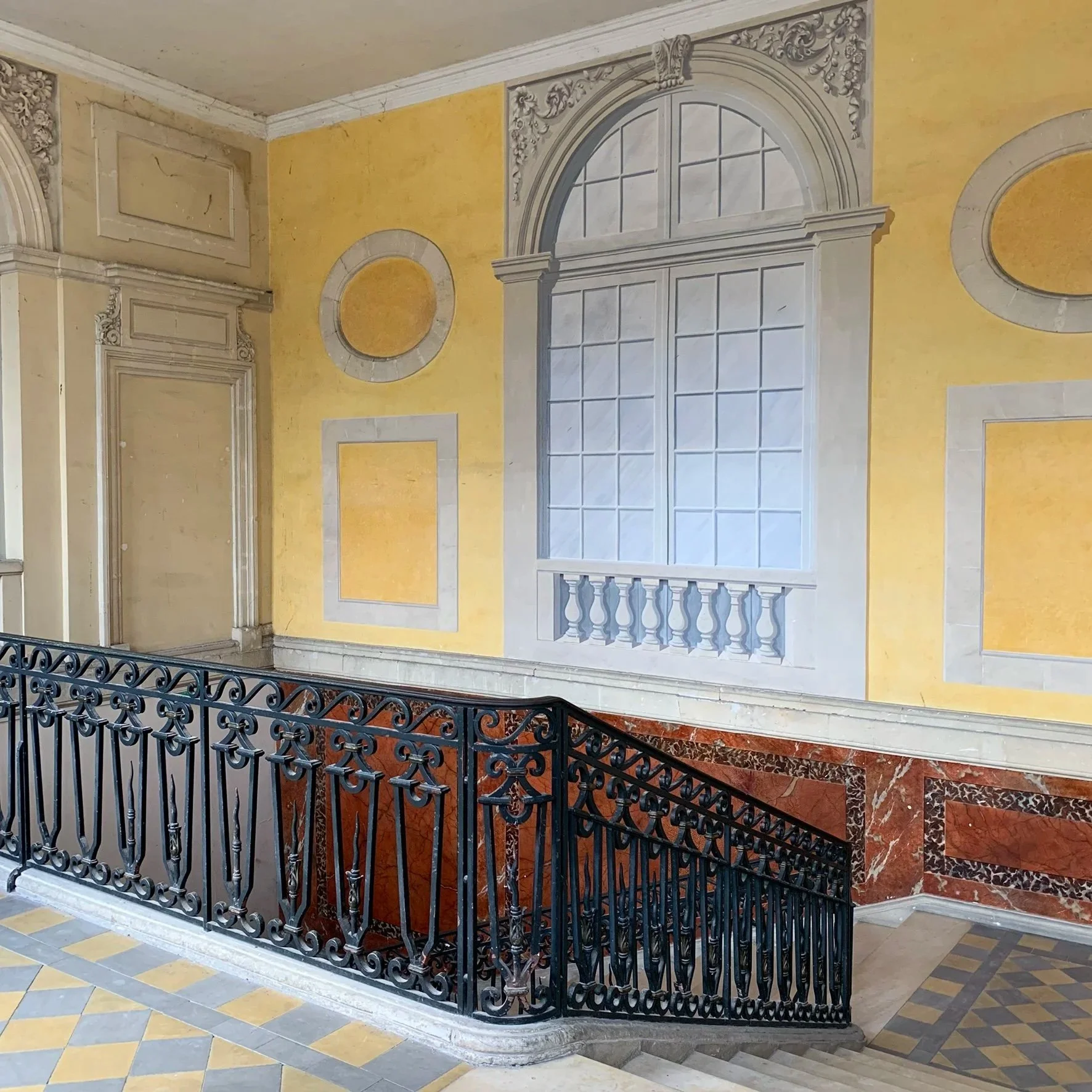
Palais de l’Archevêché, Arles, France — yellow as architecture, softened by stone and shadow.
In Arles, yellow feels less like applied decoration and more like part of the building’s memory. This is where ochre becomes architectural. Mixed into plaster or lime-based surfaces, yellow could soften stone, warm a room, and respond beautifully to southern light. The red marble tones below do something similar: they ground the space and give the yellow more weight.
This is the important shift: color moves from the painted image into the built environment. It becomes part of how a place feels, not just how it looks.
After this architectural yellow, the story moves outside. In Arles, color no longer stays inside painted rooms or staircases; it becomes part of the street, the façade, and eventually the night itself. This is where yellow begins to change from material into atmosphere — and, in Van Gogh’s hands, into light.
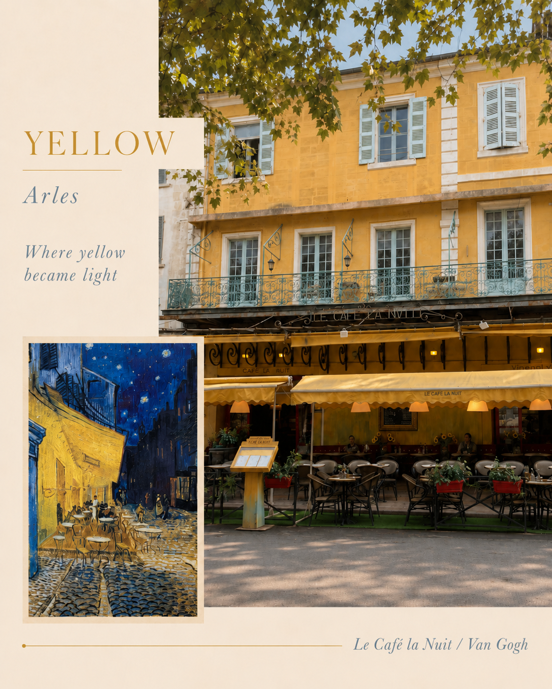
Le Café la Nuit, Arles, France — the real façade beside Van Gogh’s Café Terrace at Night.
By the time Van Gogh arrived in Arles in 1888, yellow already belonged to the architecture and landscape of the south of France. But he transformed it into something more emotional. In Café Terrace at Night, yellow is no longer only an earth pigment or a color on a façade; it becomes light itself. The terrace glows against the deep blue of the night, creating one of the most powerful contrasts in painting: warm against cool, earth against sky, the everyday café against the infinite night.
This contrast also tells a story about materials. Yellow ochres were ancient, accessible, and stable, while many blues were historically more precious, especially when made from minerals like lapis lazuli. By the nineteenth century, newer synthetic yellows made the color brighter and more intense, giving artists like Van Gogh a wider range of yellows to work with. In his hands, yellow became more than color — it became heat, feeling, and atmosphere.
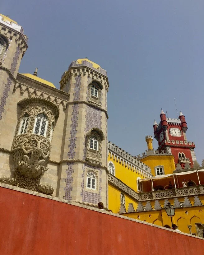
Palácio Nacional da Pena, Sintra, Portugal
When Color Became Theatre
In Portugal, yellow and red take another direction. In traditional architecture, especially in southern regions, ochres were often used in limewash and wall painting because they were local, mineral, and durable. These were colors that could live on façades as much as inside interiors — practical enough for walls, but warm enough to give buildings identity.
At Pena Palace, however, yellow and red become something more theatrical. Built from a layered history — part former monastery, part nineteenth-century Romantic palace — the colors are no longer quiet materials. They become spectacle. Yellow glows against terracotta red, stone, tile, and ornament, creating a world that feels part palace, part stage set, part dream. Here, color performs.
From Earth to Architecture
The history of yellow and red is not only a history of beauty. It is also a history of availability, chemistry, climate, and use. These were colors that could be found in the earth, mixed into plaster, carried onto walls, and trusted to last. That is why they appear again and again — in frescoes, staircases, façades, palaces, and paintings.
Blue may have carried the mystery of rarity and distance, but yellow and red carried something more immediate: warmth, structure, and place. They were the colors of the ground becoming architecture.
In Italy, they became ornament.
In France, architecture and light.
In Portugal, theatre and imagination.
Before yellow became light, it was earth. Before red became drama, it was mineral. And in every place, both became a way of seeing.
A study in color, travel, and the quiet memory of walls.