
Rosa Antico in Gallipoli
A memory painted on the walls of Salento
I became interested in discovering the story behind this color that I kept seeing again and again in Gallipoli, in the heart of Salento.
At first, I thought it was salmon, antique pink, or maybe a soft terracotta. But the more I looked at it, the more I understood that it was not simply a decorative color. It was a color connected to material, architecture, climate, and time.
In Gallipoli, this shade could be called rosa antico: an antique, mineral pink softened by lime, stone, sun, and sea air. It is not flat or perfect. It changes with the light. Sometimes it becomes salmon. Sometimes it turns terracotta. Sometimes it feels like faded rose dust.
What fascinates me most is that this color seems to come from the surface itself. From limewash, natural earth pigments, local stone, and traditional mineral finishes such as cocciopesto — a mixture of lime and crushed terracotta used since antiquity on walls, floors, and architectural surfaces.
This is why the pink of Gallipoli feels so alive. It does not cover the walls; it belongs to them. It carries the memory of the city, the texture of the plaster, the warmth of the sun, and the atmosphere of southern Italy.
This journal entry follows the story of rosa antico in Gallipoli — the pink of Salento, shaped by lime, stone, sunlight, and time.
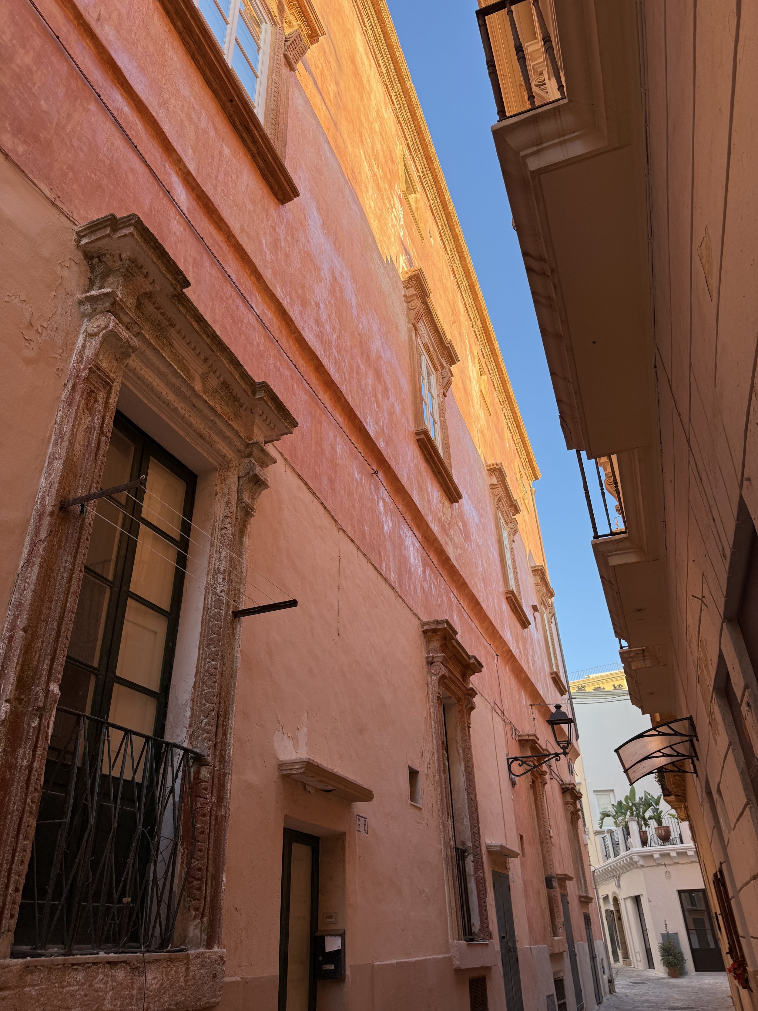
My first encounter with rosa antico felt like this: a long façade in Gallipoli, glowing under the southern sun.
The color seemed to shift as I walked past it. In the shadows, it became deeper, almost terracotta. Where the sunlight touched it, it turned warmer, softer, almost golden.
This pink does not feel like paint applied over architecture. It feels like a skin created by lime, stone, sun, and time.
In the narrow streets of Gallipoli, color does more than decorate. It guides the eye, softens the stone, and transforms the light of Salento into architecture.

The palazzi of Gallipoli tell another part of the story.
In the old town, many historic buildings were shaped by noble families and by layers of architectural influence: Renaissance balance, Baroque ornament, and later neoclassical restraint.
This façade carries that language beautifully. The monumental portal, the carved stone frames, the iron balcony, and the symmetrical composition give the building a quiet sense of importance.
Here, rosa antico becomes the background for architecture. It softens the monumentality of the palazzo and makes the façade feel noble without feeling distant.
The dark green door, the pale stone details, and the wrought iron balcony create a perfect contrast against the faded pink. The result is elegant, historic, and deeply Mediterranean.
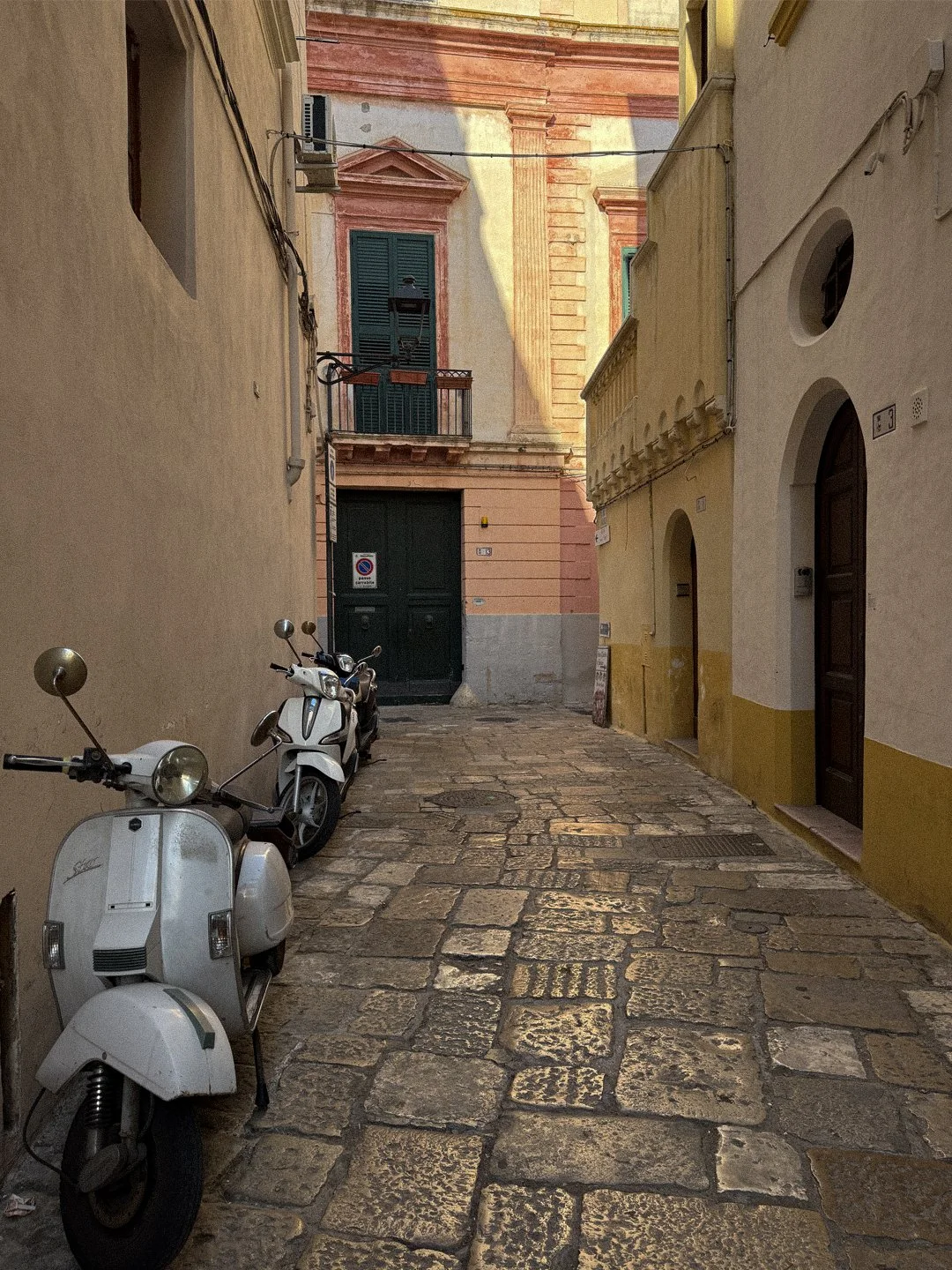
The beauty of rosa antico is that it does not only appear on important buildings. Sometimes it appears at the end of a narrow street, between scooters, shadows, green shutters, worn stone pavement, and touches of yellow.
In Gallipoli, the yellow feels just as essential as the pink. It appears as giallo ocra — a warm, earthy yellow that belongs to the same mineral world as rosa antico. Both colors seem to come from the materials themselves: lime, stone, natural pigments, dust, and sun.
The yellow brings light into the narrow street, while the rosa antico adds warmth and depth. Together, they create a palette that feels unmistakably Salento: soft, aged, sunlit, and imperfect in the most beautiful way.
Nothing here feels overly designed, yet everything belongs together. The faded pink, the ochre yellow, the dark green shutters, and the old stone pavement all speak the same language — a language of earth, architecture, and time.
In Salento, color is not decoration. It is atmosphere.

In this wall, you can see the layers of plaster, the marks of application, the texture of the surface, and the traces of time. The pink is deeper here, almost mauve, with a tactile quality that makes the wall feel alive.
This is where the story of the color becomes clearest.
Traditional lime and mineral finishes do not create a perfectly flat surface. They create movement. The light enters the texture, breaks across the wall, and softens the color.
The small sculptural detail feels almost like a guardian embedded in the surface. It adds another layer of history, turning the wall into something more than architecture.
It becomes a memory of hands, materials, weather, and time.
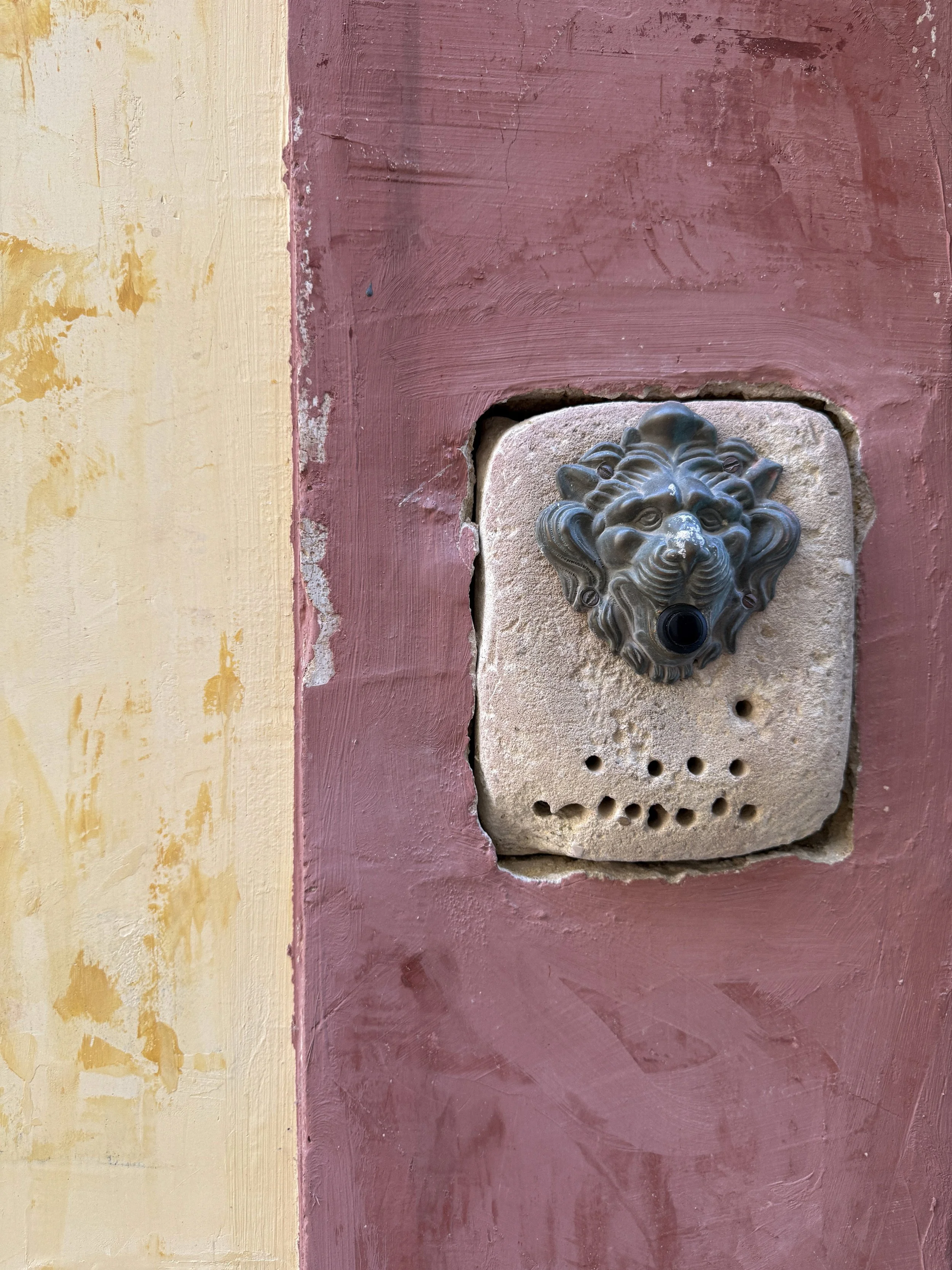
Up close, the wall becomes a small piece of theater.
At the center is the lion’s head — dramatic, almost watchful — set into the stone like a quiet guardian. It is a small detail, but it carries the presence of something much older.
In Italian architecture, lion heads have long appeared on doors, knockers, fountains, and thresholds. They were never only decorative. The lion has traditionally symbolized strength, protection, nobility, and vigilance. Placed at an entrance, it marked the passage between the street and the private world behind the door.
Here, that symbolism survives in a quieter, more domestic form. It is no longer a grand bronze knocker on a palazzo door, but a small doorbell embedded into a weathered wall. Still, it holds the same power. It asks to be noticed.
What makes the image even more beautiful is the way the lion sits between color and material. The deep rosa antico around it feels worn and tactile, while the pale yellow beside it brings a softer light into the composition. Together, they feel less like painted surfaces and more like layers of the city itself — lime, pigment, stone, sun, and time meeting in one small corner.
For me, this final detail holds the essence of Gallipoli: beauty in the imperfect, history in the ordinary, and a sense of protection at the threshold.
A wall. A lion. A trace of yellow.
A quiet ending to the story of rosa antico in Salento.